
You don't just need a website. You need a website that converts.
It's time to get a website that not only looks good, but brings you more leads, more subscribers, and more revenue.
SEEN IN & TRUSTED BY:


Web design that actually works
I build websites with one purpose in mind: to make sure they work for you.
That means moving the needle for your business. Bringing you more leads. More sales. More subscribers. More of whatever success looks like for your specific business.
Designed for conversions
(not a portfolio)
Sure, your site has to look good. That’s a given, but it’s nowhere near enough.
The internet is loaded with gorgeous, award-winning sites that sadly don’t do much for anyone’s business. (Except maybe the designer’s.)
Web usability studies show without doubt that there’s such a thing as overdesigning a website.
Distracting images, confusing animations, seasickness-inducing parallax…
These things look great in a design portfolio. But they usually absolutely destroy conversions.
As part designer, part conversion specialist, I do things a little differently. I’m focused on what happens after the “oohs” and “aahs” fade:
- Will visitors actually take action?
- Will they understand what you're offering in 3 seconds flat? (That's a thing.)
- Will they trust you enough to hand over their email (or credit card)?
- Will they feel safe reaching out to you?
That’s the difference between a digital brochure and a 24/7 business-building machine.
Built on best practices not templates
It’s so tempting to jump right in and start talking about colors and fonts and all that. But that doesn’t build the strongest foundation.
So before nudging one pixel or writing a single line of code, we’ll dig into what makes your business tick. Who your ideal customers really are, and what keeps them up at night. Then we build a site that speaks directly to those people with laser-focused messaging that converts curiosity into action.
No cookie-cutter templates. No unnecessary bells and whistles. No jarring animations.
Just strategic design decisions backed by what actually works.
A BRIEF LOOK AT THE DELIVERABLES
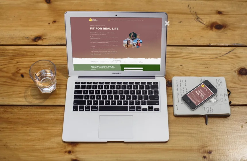
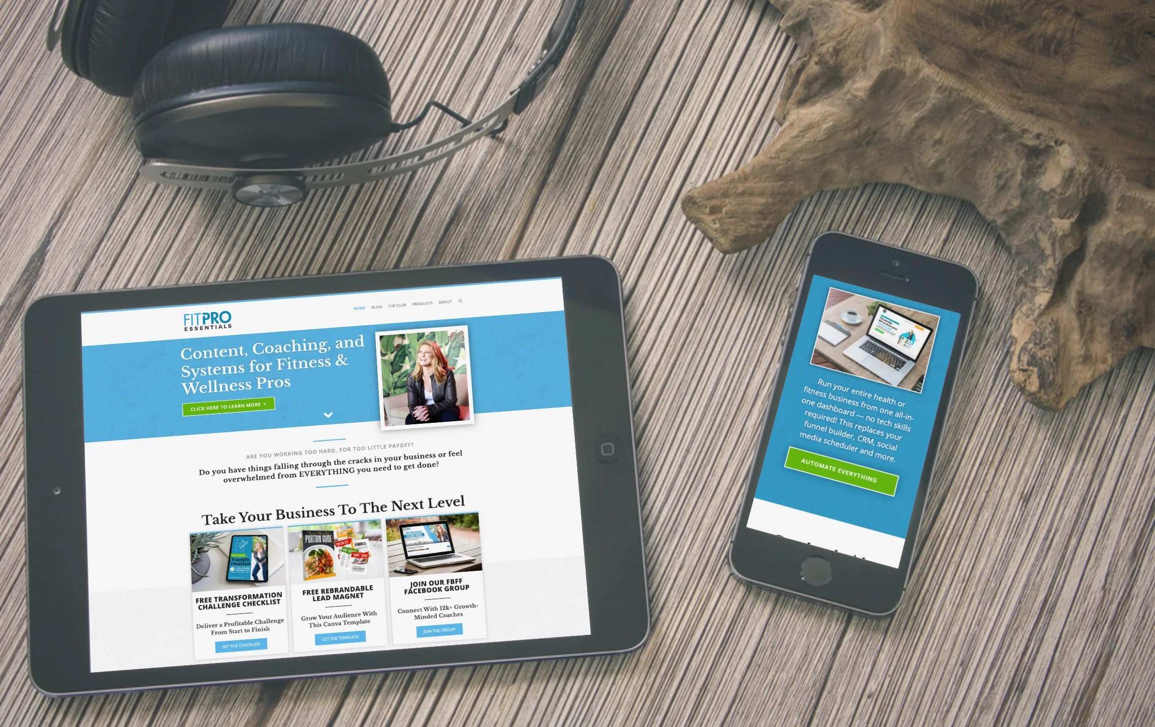
Every site is built for business
Wicked fast
Because every second of loading time costs you money and leads. Literally. We’ll optimize the heck out of your site until it’s blazing.
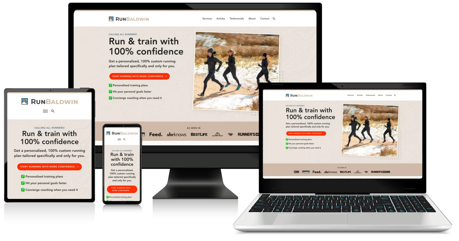
Fully responsive
This doesn’t just mean looking good on today’s popular devices. It must also work, be fast, and built to convert.
SEO ready
SEO isn’t dead. It’s just different now. Your site will be ready for today’s technology so that search engines and customer’s can find you.
Secure & reliable
Having an amazing site doesn’t matter much if it crashes. We’ll make sure your site is reliable, up to date, and backed up.
Targeted
Your site must resonate with your customers. I’ll help you nail down your design, messaging, and offer creation.
Built for leads
Most sales don’t happen on the first visit. So I’ll build in systems to help you stay in touch with the prospects that matter most.
Quick without cutting corners
Good news… your project won’t take forever. My trademark 5D process is fast, efficient, and has been working for years. No six-month timelines, endless revisions, or ever-expanding budgets.
We all love surprises but maybe not so much when it comes to our businesses and livelihoods. That’s why throughout the process you’ll always know what’s going on, you’ll know what’s next, and everything will just slide into place.
Boring? Maybe. But that’s a whole lot better than phone calls that start with, “Sorry, we’ve had another setback.” And I’ve never heard a client complain about getting done on time and on budget.