
SEE SOME RECENT WORK
Beautiful Brands, Designed to Convert
I help consultants, coaches, & small businesses make more money with their websites
FAST
CLASSY
SEO READY
BUILT FOR CONVERSIONS
SEEN IN & TRUSTED BY:


MY BUSINESS IS HELPING YOU BUILD YOUR BUSINESS
Is your site designed to bring in actual revenue?
Most websites are really nothing more than brochures. They look fancy, but usually don’t generate any business.
Why? Because design is only one small part of the full picture of any business. There’s also messaging, building a list of prospects, and getting rid of those annoying things that push customers away.
That’s what my approach is all about. Not just design. But design that’s part of an business machine that converts traffic into leads, and leads into revenue 24/7.
Your website needs to grab attention, focus that attention, and direct prospects exactly where you want them.
MY MOST POPULAR BUSINESS BOOSTERS
3 ways I can help you...
Revenue-based design that pulls in business
Your branding is NOT supposed to be the next Mona Lisa. It just needs to look nice, function well, and help you acquire customers. My easy, quick process will get you up & running with a bulletproof, fast, and sexy sales machine.
Get more leads & profit from the traffic you’ve got
If your visitors aren’t turning into actual revenue…there’s a problem. Most people try “fixing” this with expensive redesigns & guessing. (Which usually makes things worse.) A better option? Let me find the leaky holes and plug them.
Get the design & maintenance work you need
In-house & full-time designers can be very expensive. And they’re still expensive even when there’s no designing to do. Best solution? Fractional webmastering. Get the work you need, when you need it. No headaches. No overcharging.
Feedback from recent clients.
Ready to see some web design work?
Every website is 100% customized to fit each client perfectly. And of course each is fast, responsive, SEO-ready, and built to pull in leads & revenue.
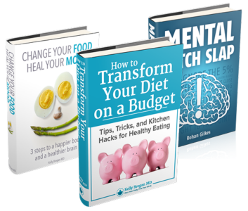
Launch Your Books the RIGHT Way...
I can help you design, prepare, launch, and profit from your books.
Whether you’re writing a simple PDF for your subscribers, the next great American novel, or a Kindle book…I can help you get it out there the right way.
I’ve launched hundreds of books for every online
marketplace & device including:

WHO EVEN IS THIS GUY?
Hey, I'm Charlie
I’m a designer & web strategist, and since 2007 I’ve been helping experts like you build, scale, and automate their brands.
I do it with clear messaging, simple design, and smart systems. In a nutshell, the goal is to help you have a business that earns more but requires less time to run.
Curious to learn more? Here you go

750+
Happy Clients
575+
Books, Courses &
Products Launched
4
Brands Purchased
in Major Acquisitions
16 years
Working with Mom-&-Pop Shops…to Fortune 500’s
HAVE SOME QUESTIONS?
Frequently Asked Questions
I don’t know what I need, but I know I need something. Things just aren’t working like I expected.
I completely understand. Most of my incoming clients fall in this bucket. This is actually a really good spot to be in because it tells us one thing in big red flashing letters:
As any good doctor would tell you…you need a proper diagnosis.
A lot of people see their business isn’t doing great and immediately hop into top-down redesigns, expensive ad campaigns, etc. That might work but it might not. And you just don’t know until that time & money is spent.
I have a consultation/audit that may be for you. It’s designed to pay for itself and uncover exactly what will get you from Point A to Point B in the fewest possible steps. You can check it out here
Can you help with existing websites, sales pages, and funnels?
Absolutely! I can revamp, optimize, and enhance your current infrastructure to make sure it’s all pulling its weight.
One of my most popular offerings is full site audit, where I find out exactly where you’re currently leaking customers and revenue.
What makes your lead acquisition strategies effective?
Well…science. I focus on customers first. Real people with real needs & wants. That gives me data. I use that data to attract prospects & build you a valuable email list full of buying customers…not tire kickers.
And let’s clear the air here a bit. Some agencies do anything to build a big list full of random whosits, thinking that’s where the money is.
It doesn’t really work like that. A list of 10,000 people who never buy is far less valuable than a list of 10 people who buy everything you produce.
That’s what I focus on: building a list of people who are ready, eager, and willing to buy what you’re offering.
How do you measure sales funnel success?
Success is measured through increased conversion rates, higher average order values, and more lifetime value per customer. We use analytics and feedback to continuously tweak things towards higher conversions and revenue.
Do you have à la carte offerings?
Yes! What you see here is just the bird’s eye view. You may need all of it, some of it, or none of it.
All of my work – every single piece of it – is built from the ground up. It’s all custom, bespoke, and tweaked to fit into your specific business.
So drop me a line if you need help. I’ll get you moving in the right direction or I know someone who can.
I just need random help, updates, and maintenance from time to time. You got something for that?
Sure do. Sounds like you might need exactly this.
I'm launching a new offering and need a landing page/site up fast. Can you help?
Yup. Sometimes there’s a very good reason to shortcut the full branding process and just get moving, gather data, gauge response, etc.
I understand that completely because I’ve been there myself.
If that’s you, I’m happy to chat about my Site-In-a-Week (or so) process. Get in touch here.