Is your website a noxious visual miasma? A hideous concoction of strident hues? A vomitous amalgamation of eye-related wretchedness? Well, this post may be for you.
 You know how when you walk into Baskin Robbins, you see all those ice cream colors? And there’s that smell in the air? That sweet waffle cone smell that makes you feel like your nostrils just got a cavity? That shouldn’t be your website.
And with that, I welcome you to Part 3 of our “10 Ways to Make Your Website Look Better” series.
Today, we’re going to talk about color.
An introduction, and why I’m even bothering
I think it’s safe to say that MOST of us don’t use hideous color schemes in our designs. The reason for that is simple and quite obvious: they’re hideous. They stick out like a sore thumb. A hideous sore thumb with yellow and purple and green bruising. Maybe even an open sore that…nevermind. You get the point.
 This post isn’t about the huge glaring mistakes you can make by using really awful color mixtures on your brochures or website. Well…it sort of is. But it’s also about the fine-tuning, such as picking hyperlink colors for your text. Or finding the right color for the chapter titles in your book.
Well, it’s all about integrity.
Integrity of the Piece
I like to think that every project has its own purpose. A website isn’t just a website. It’s a website ABOUT something. It’s about fishing or cooking or cross-country running.
A logo isn’t just a picture or symbol. It’s a picture or symbol ABOUT something, like food or health or technology.
 That’s where the integrity comes in: your visual assets are supposed to be doing something, and that something is communicating a message. Your fonts, colors, layout, images, etc. all support (or should) that overall message.
So…if your header is red and your main content bright green, ask yourself, “What is this doing for my overall message?”
But overall, just be practical
Back in college, where I studied architecture, I gave an end-of-quarter presentation about a building I’d designed over the prior three months. At the end of the presentation, one of the visiting architects in the audience raised his hand and said, “Architecture isn’t about building.” Um, what?
Yeah, I know. I thought so too. But that’s not even the crazy part. He then said, “Architecture is philosophy. Every brick in your building should have a purpose. What is the purpose of the bricks in that wall?” he asked, pointing to my model.
When I replied that the bricks were holding up the ceiling, he insisted that I think harder about it.
My point is, it’s all too easy to go overboard with thinking deep thoughts and philosophizing about every last detail. “Red means impulse” and “Blue means peace” and “If you mix tan with off-white, it means please take your shoes off before entering.”
You can drive yourself nuts with this stuff, and it’s quite likely that your audience isn’t going to get it anyway. So don’t go all introverted on me.
The overriding function of your site, business card, logo, etc. is that it simply look awesome and communicate. Your site, regardless of whatever deeper meaning it has as a whole, simply needs to be legible.
I could lie about the text on this site and say that I chose black text on a white background because it symbolizes how I hope for equality between cardboard manufacturers. But nope. Black on white is easy to read. That’s it, and you really don’t need a better answer than that.
Where to find a color scheme
Speaking on the integrity thing, your golf site probably needs some green in it. It just makes sense. Again, you could go all avant-garde and do it in pink with elephants all over, but your audience is going to miss such subtle symbolism.
So…you know you’re looking for a green color scheme, but how do you come up with one that works? If you use one shade of green here, what shade works over there? And what sort of text will be legible?
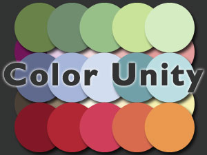
Well, a great place to start (after you’ve experimented…which is the best way to learn, I think) is to head over to Kuler. Kuler is a color scheme picker and it’s phenomenal. The first thing you’ll see there are sample color schemes, complete with RGB and hex codes. Simply browse around the site a bit, or do a search for “green” and you’ll have all the schemes you’ll need.
And the really cool thing is that after you pick a color scheme, you can tweak individual colors of that particular palette. So, for example, if you’re still working on your green golf theme, you can start by exploring for a green scheme that works overall. Then you’ll need some colors to use as emphasis, say for your logo or text hyperlinks, right? Well, you can use that little slider dealy to find them and you’ll see exactly how the colors will all interact.
That’s it for this week! Thanks for reading! We’ll be back next with some great tips on how to format the text on your page so it’s easy on your visitor. Want a hint? Well, your old school professors had it all wrong…but you knew that already. :)
If you missed the other parts of this series, you can find them here:
- 10 Ways to make your website look better
- 10 ways to make your website better, Part 1 – Effective eye trails
- How proper line height will improve the look and stickiness of your site
And if there’s something else you’d like to see here, or you’re looking for advice on some particular woes, just let us know in the comments or contact us.